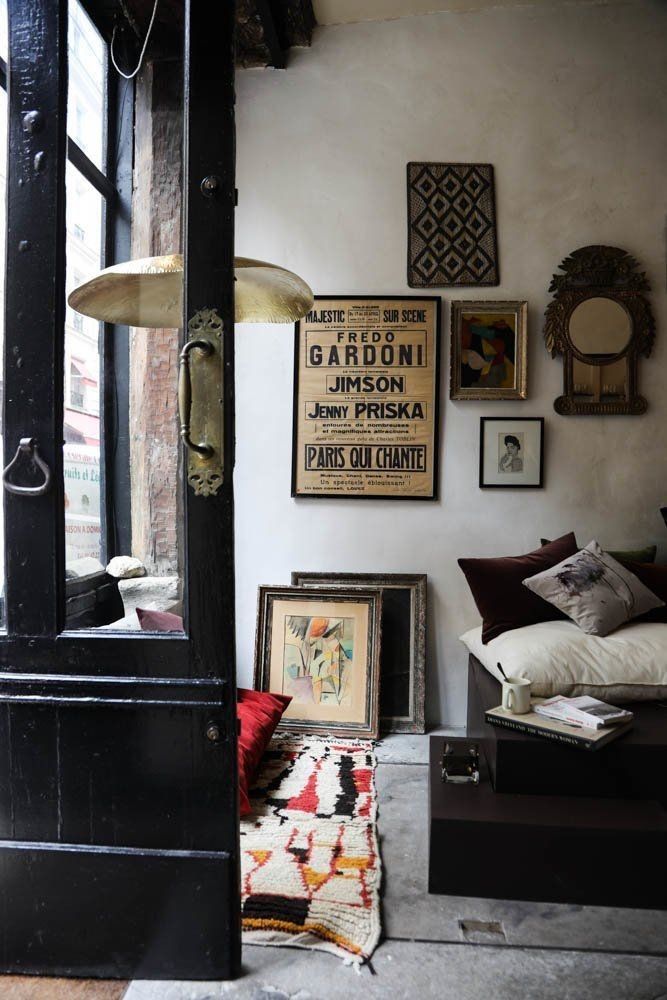
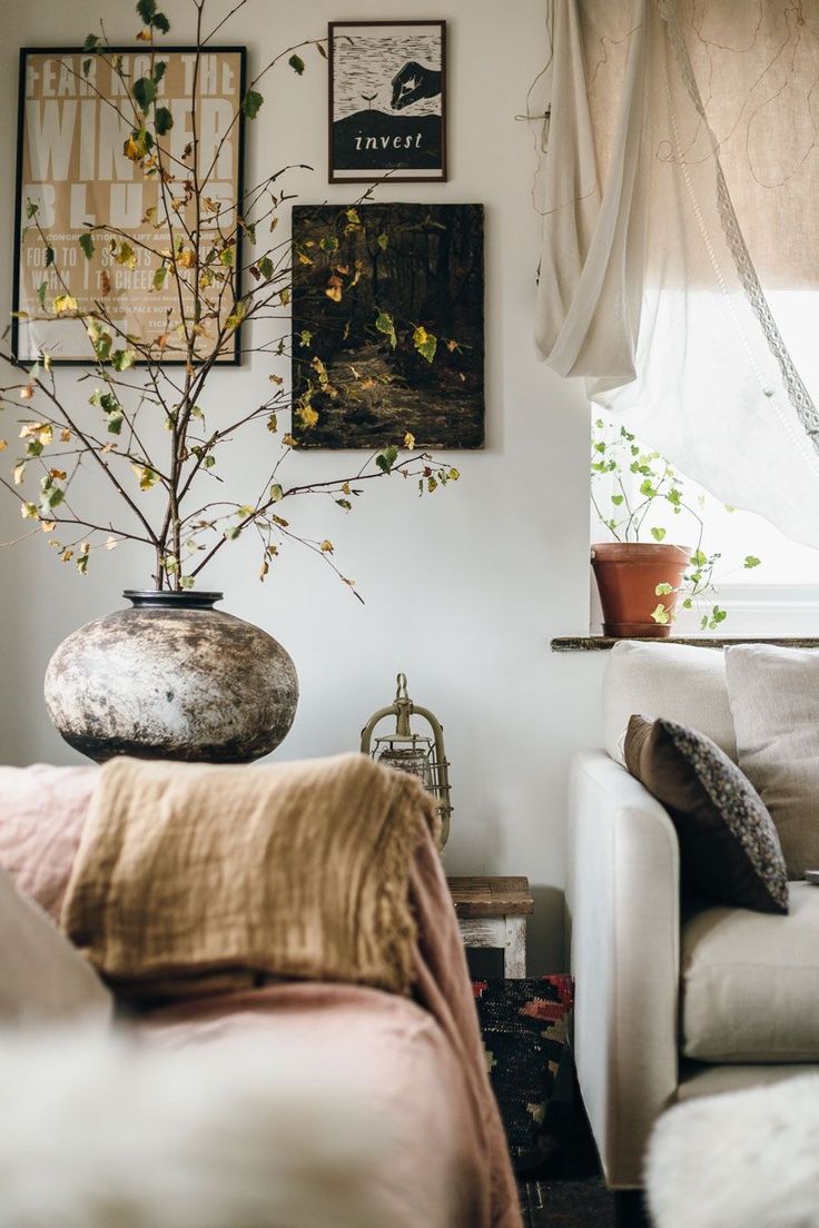
There’s something undeniably cool about retro typography posters. With their nostalgic fonts, bold colors, and old-school design flair, they bring a mix of vintage charm and modern edge to any room. Whether you’re channeling mid-century diner vibes, 1970s psychedelia, or minimalist Bauhaus graphics, these posters tell a story through type — and make your walls feel alive.
1. Mix Vintage Fonts with Modern Spaces
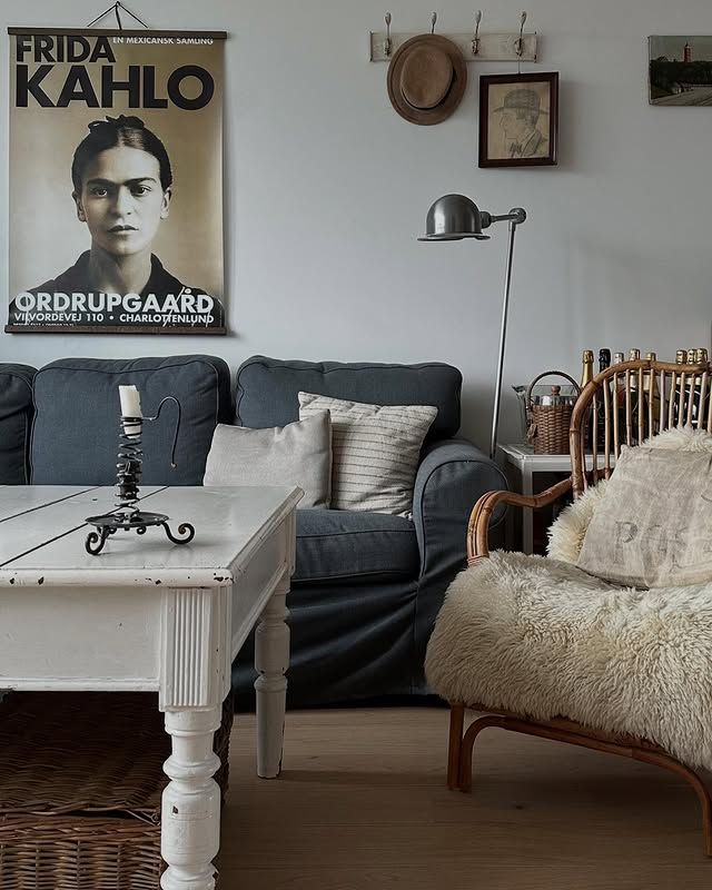
One of the easiest ways to create balance is by hanging retro typography posters in a sleek, modern room. The contrast between clean-lined furniture and nostalgic lettering makes both elements pop. Try pairing a mid-century modern sofa with a framed vintage travel or soda ad — the typography becomes the art, instantly adding personality.
2. Go Bold with Color and Scale
Retro posters were never shy about color. Think mustard yellows, faded reds, teal blues, and punchy blacks. Don’t be afraid to go big — one oversized typography poster above a console or bed makes a confident statement. For smaller rooms or gallery walls, mix different poster sizes for a collected, casual look.
3. Create a Theme or Era
Choose a decade or style to anchor your display. A wall filled with 1950s ads featuring chrome-like fonts and diner-inspired hues feels playful and nostalgic, while a 1970s setup with groovy lettering and warm earth tones feels relaxed and soulful. The key is consistency in tone — let the typography tell the era’s story.
4. Frame with Intention
A clean black or white frame can make even the most whimsical vintage print feel curated and intentional. If you’re going for a true retro look, try wood tones or brass finishes that match the time period. Floating frames or simple poster rails work well if you want a casual, gallery-style vibe.
5. Pair with Complementary Decor
Retro typography pairs beautifully with industrial accents, mid-century furniture, or eclectic boho decor. Think old records, globe lights, metal shelving, or a leather lounge chair. The key is to let the posters feel integrated — not like afterthoughts — by echoing their colors or textures in your space.
Final Thoughts
Retro typography posters are more than just wall art — they’re visual time capsules. They remind us of design eras that shaped how we see style, advertising, and creativity. Whether you use one as a bold focal point or curate a wall full of vintage letterforms, you’ll add warmth, nostalgia, and personality to your home.