A logo is so much more than just a pretty graphic at the top of a website. It is the visual anchor of your entire business. It dictates your packaging, your social media presence, your website layout, and the exact type of clients you attract.
For creative entrepreneurs, interior designers, and lifestyle influencers, creating a “feminine” brand is a popular goal. However, there is a massive difference between a logo that feels overly trendy or juvenile and one that feels effortlessly chic, high-end, and intentional.
If you want to design a feminine logo that commands premium prices and stands the test of time, here are the essential design secrets you need to know.
1. Move Beyond the “Millennial Pink” Cliché
When people hear “feminine web design” or “feminine branding,” their minds often jump straight to bright bubblegum pink or glittery gold textures. While there is absolutely a place for soft, romantic tones, modern feminine branding is incredibly diverse.
To create a luxury feel, look to a more nuanced, sophisticated color palette:
-
Earth Tones: Muted terracotta, warm ochre, and soft sage green.
-
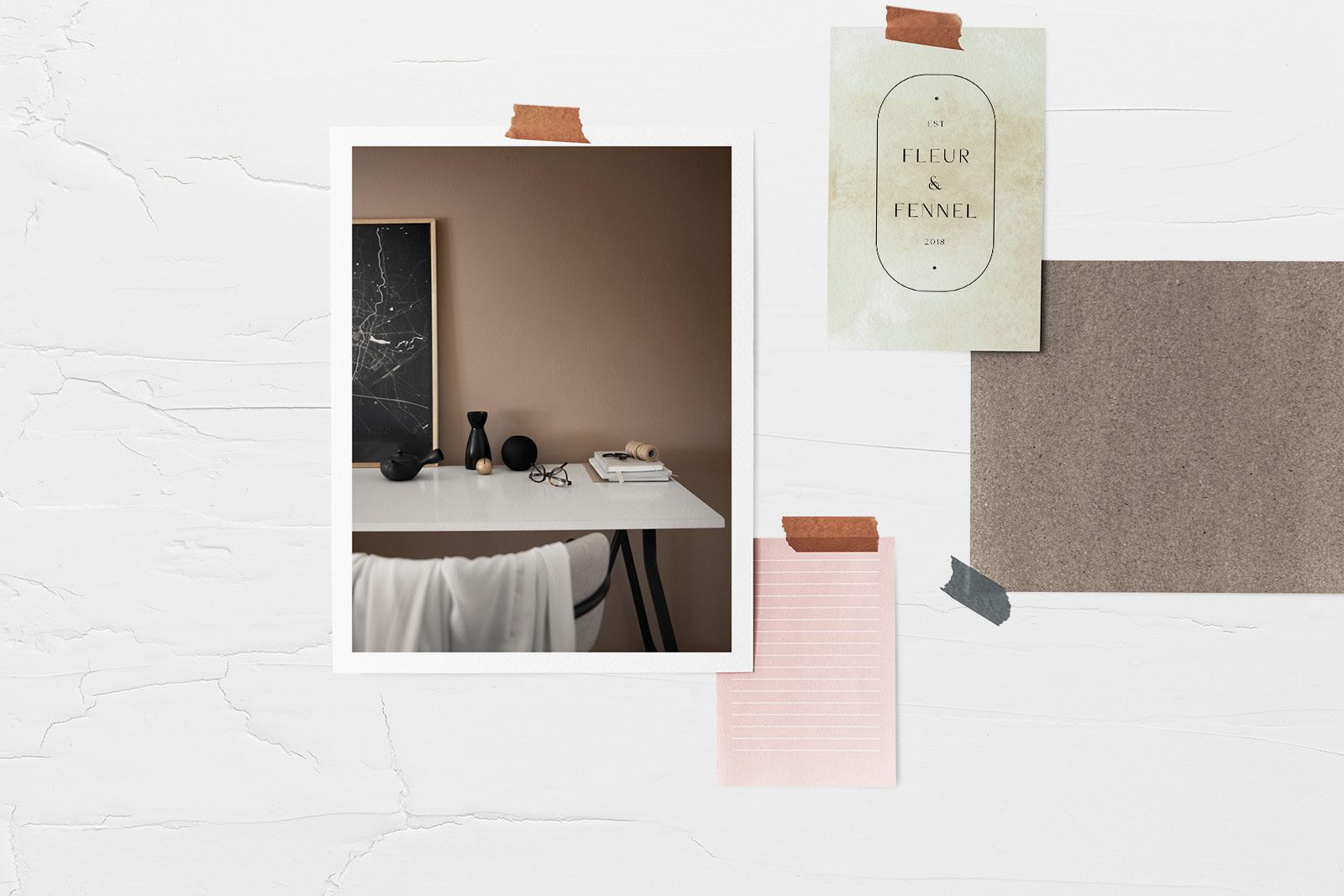
Elevated Neutrals: Creamy alabaster, warm taupe, and rich charcoal gray (which feels much softer and more expensive than stark black).
-
Subtle Blushes: Dusty rose, nude, or sand tones that add warmth without screaming “pink.”
The Golden Rule: A great logo should always be able to function beautifully in pure black and white first. If it relies entirely on a specific color to look good, the underlying structure isn’t strong enough yet.
2. Choose Typography with Personality (Serif vs. Sans-Serif)
Typography does the heavy lifting in logo design. The fonts you choose instantly telegraph your brand’s price point and vibe.
The Editorial Serif
If your brand style is classic, upscale, and romantic (perfect for interior designers and high-end bloggers), an elegant serif font is your best friend. Look for high-contrast letterforms—meaning the font has a beautiful mix of thick and thin lines. Fonts with delicate, sweeping ligatures (where letters gracefully connect) feel deeply artistic and custom-made.
The Modern Sans-Serif
If your aesthetic leans more toward minimalist, clean, and contemporary lifestyle imagery, opt for a structured, wide-spaced sans-serif font. Increasing the tracking (the space between each letter) instantly gives a logo a high-fashion, editorial layout feel.
3. The Power of Custom Monograms and Submarks
A primary logo layout (usually your full business name spelled out horizontally) is perfect for your website header. But what happens when you need to stamp a tiny social media profile picture, a website favicon, or a sticker for product packaging?
A complete brand identity needs a submark or a monogram.
-
The Monogram: An elegant interlocking of your business initials.
-
The Submark: A simplified, often circular version of your logo that fits neatly into small square spaces.
Having these variations makes your business look instantly more professional, cohesive, and established.
4. Keep Line Art and Icons Clean and Minimalist
If you want to include an icon or an illustrative element in your logo—like a botanical sprig, a classic arch, or an abstract line drawing—the key word is restraint.
Avoid overly intricate illustrations. When a logo has too many tiny details, it turns into an unreadable smudge when scaled down on a mobile screen. Stick to clean, minimalist line art that feels light, airy, and open. The more breathing room you give the design, the more luxurious it will feel.
Final Thoughts
Designing a feminine logo isn’t about adding decorations; it’s about editing down to the absolute essence of your brand’s beauty. By pairing sophisticated typography with an intentional color palette and clean, scalable layouts, you create a brand identity that will beautifully carry your business for years to come.