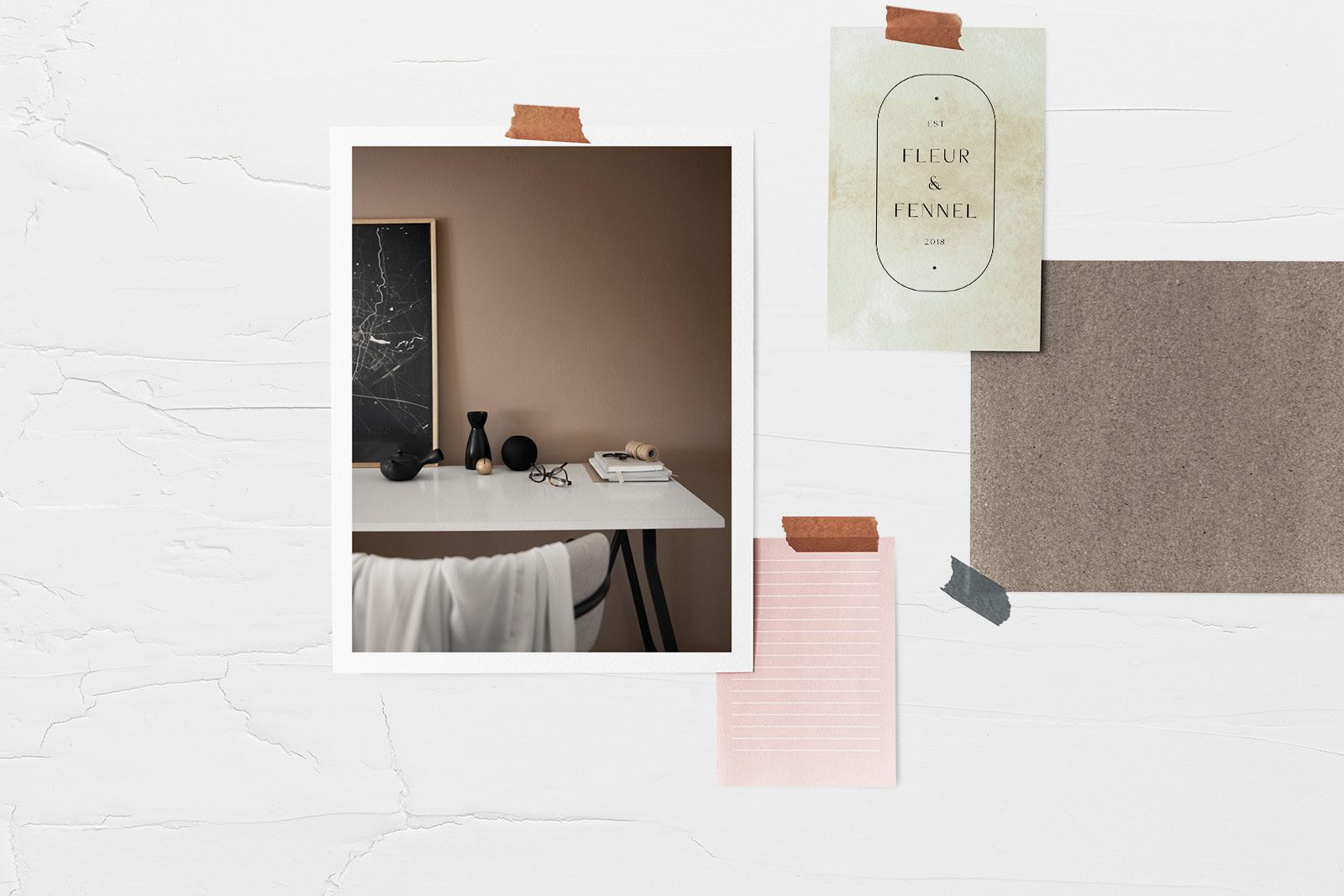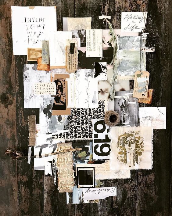
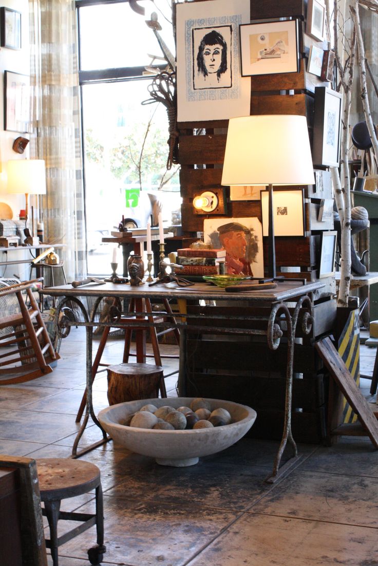
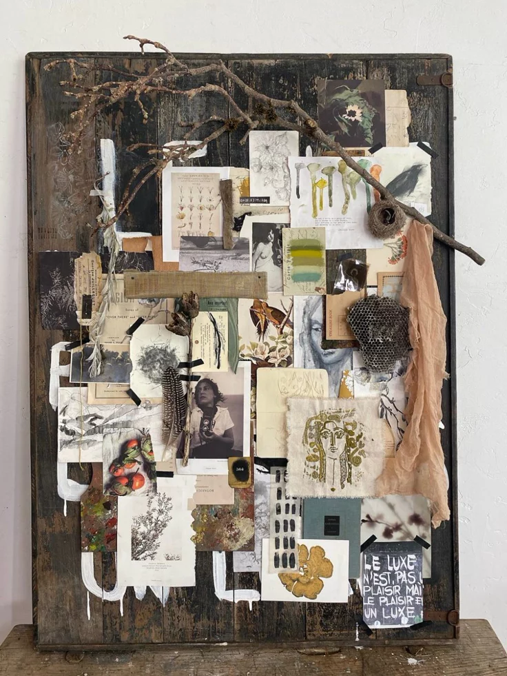
If you’re planning a room makeover, a brand refresh, or even a wardrobe overhaul, a Boho Inspiration Board is your secret weapon. Because Bohemian style is so eclectic and “busy,” it is incredibly easy for a space to go from “artistic retreat” to “cluttered garage sale” without a clear vision.
An inspiration board (or mood board) acts as your North Star, keeping your textures, colors, and patterns in perfect harmony. Here is how to build one that actually works.
1. Define Your “Boho Flavor”
Boho isn’t a one-size-fits-all look. Before you start pinning, decide which direction you’re heading:
-
Desert Boho: Warm terracottas, cactus greens, and sun-bleached woods.
-
Whimsical/Global Boho: Vibrant jewel tones, intricate Moroccan patterns, and layers of velvet.
-
Minimalist/Scandi-Boho: Lots of white space, light woods, and simple black accents.
2. Layer Your Textures First
In Boho design, texture is more important than color. Your board should reflect this. If you’re making a physical board, clip fabric swatches. If it’s digital, look for high-res photos of:
-
Woven rattan or wicker.
-
Chunky macramé or fringe.
-
Distressed leather or soft linen.
-
Natural stone or unfinished wood.
3. The 60-30-10 Color Rule
To keep your board from looking like a rainbow exploded, try to organize your colors by these proportions:
-
60% Neutral Base: (Cream, beige, or white).
-
30% Secondary Earth Tone: (Sage green, mustard yellow, or rust).
-
10% “Pop” Color: (Turquoise, deep plum, or matte black).
4. Add the “Living” Elements
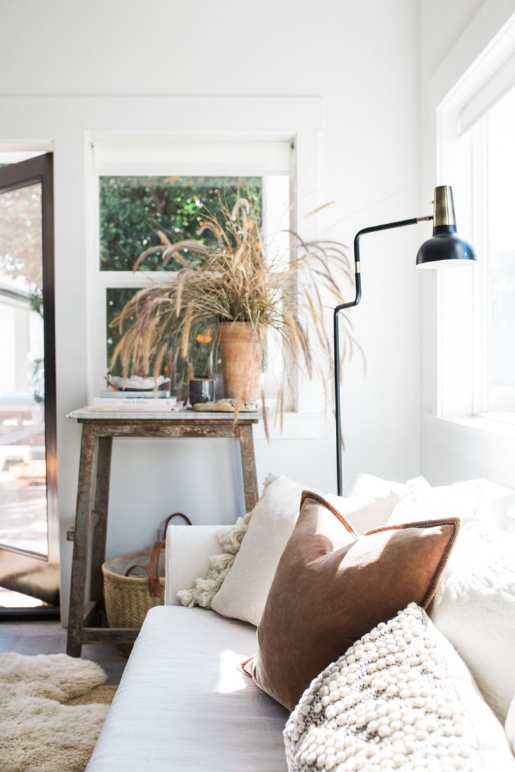
Boho is nothing without nature. No inspiration board is complete without botanical elements. Include images of:
-
Dried pampas grass.
-
Trailing Ivy or massive Monstera leaves.
-
Eucalyptus sprigs.
5. Don’t Just Use Furniture
A great mood board includes vibe shots. Don’t just pin a chair and a rug. Pin a photo of a sunset in Sedona, a vintage VW bus, or a pile of old books. These “mood” images help capture the feeling of the space, not just the inventory.
Pro-Tip: Digital vs. Physical
-
Digital (Pinterest/Canva): Best for gathering a massive amount of ideas quickly. It’s great for checking how specific products (like that rug you found on Wayfair) look next to your wall color.
-
Physical (Corkboard/Foam Core): Best for true interior design. Being able to touch the “roughness” of a jute sample versus the “softness” of a velvet pillow is something a screen can’t replicate.