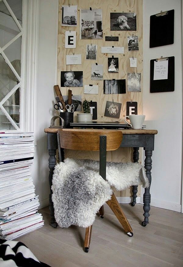
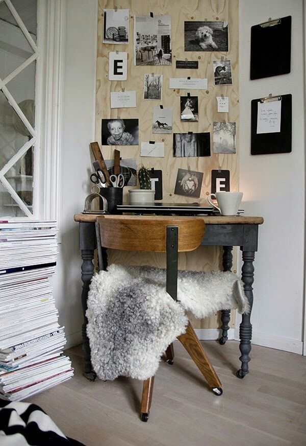
If you’ve done a gallery wall before, you know the drill: measure the center, level the frames, and try not to turn your wall into Swiss cheese. But in 2026, the trend has shifted away from rigid, symmetrical grids toward Intentional Maximalism. The goal now isn’t a perfect line; it’s a wall that feels like a curated collection gathered over a lifetime. Here is how to create a gallery wall that feels fresh, modern, and high-end.
1. The 70/30 Rule of Texture
Standard gallery walls can sometimes feel like a flat museum exhibit. To give your wall “soul,” you need to break the two-dimensional barrier. Aim for a 70% art, 30% object split.
-
The Art: Use your standard framed prints, canvas, or linen-textured paper.
-
The Objects: This is where the magic happens. Intersperse non-art items like vintage brass trays, woven wall baskets, a minimalist wall clock, or even a sleek ceramic bud vase mounted on a tiny floating ledge.
-
The Result: Adding objects creates depth. It forces the eye to travel across different planes, making the wall feel like a 3D installation rather than just a decorated surface.
2. “Soft Modern” Curated Clutter
The era of perfectly matching black frames is officially over. For a contemporary look, embrace Mixed Materiality. * Mix Your Finishes: Pair light oak frames with thin black metal and a few rounded or arched frames. The contrast between sharp corners and soft curves is what makes a wall feel “designer” rather than “DIY.”
-
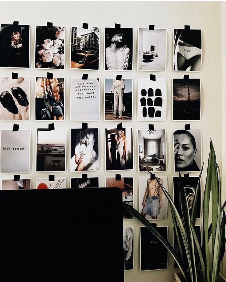
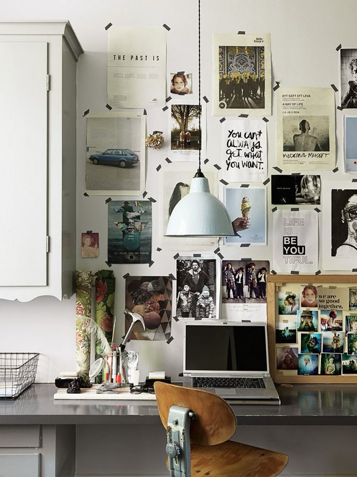
The Organic Cluster: Don’t feel obligated to line up the edges of your frames. Instead, build an “organic cluster” where the spacing varies slightly. It should feel instinctive—as if the wall grew over time as you found new pieces you loved.
3. The “Subdomain” Layout
If you are working with a massive wall, a single cluster in the center can actually make the room feel smaller. Try the Subdomain Strategy instead.
-
Start with one main “anchor” cluster of 3–5 pieces at eye level.
-
Then, “orbit” smaller groups of 1 or 2 pieces further out.
-
This allows the gallery to “bleed” into the architecture of the house—wrapping around a corner into a hallway or following the upward line of a staircase. It makes the art feel like a part of the home’s skeleton.
4. The “Shelf Overlay” Technique
This is the ultimate pro move for 2026. Install a single, long picture ledge across the middle of your designated gallery area.
-
The Layer: Hang your larger frames directly on the wall behind the shelf.
-
The Lean: Lean smaller prints, postcards, and small sculptures on the shelf in front of the hanging pieces.
-
Why it works: Overlapping your art creates a “layered” look that is impossible to achieve with hanging alone. It adds a sophisticated, casual elegance to the room.
5. Pro Tip: The “Template” Hack
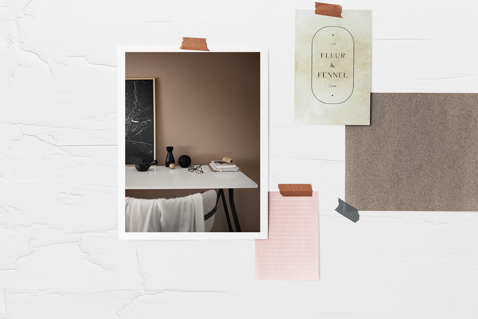
Before you hammer a single nail, trace your frames and your 3D objects onto brown butcher paper. Tape the cutouts to the wall using painter’s tape and leave them there for 24 hours.
If you walk past the wall a dozen times and the layout doesn’t feel “top-heavy” or cluttered, you’ve found the perfect balance. Now, you can nail directly through the paper and tear it away when you’re done.
What’s the “hero” piece of your collection? Every great gallery wall usually starts with one oversized or high-contrast piece that sets the tone for the rest.